Every single one of these maps reveals different fun and interesting facts, from which we can make some interesting inferences. There’s usually no better way to illustrate the economic, social and cultural differences between different parts of the world than by displaying them on a map.
Ever wondered which is the happiest country or which alcohol beverage is the most popular around the world? Find out and discover more fun facts with these 32 educational maps.
Have you ever wondered where in the world the most and least photos are taken? How is the human population or economic production distributed across the globe? These maps – some of which are new and some of which are old favorites – answer questions like these in an intuitive way.
NOTE: Studies like these, while entertaining or interesting, are not always 100% accurate. Leading questions and limited sample sizes are just a few of the data gathering problems that could be present in maps like these.
The Most Photographed Places In The World

Photo – Image credits: imgur.om
Happiness Map

Image credits: tutonew.com
Earth’s Seasons

Image credits: visibleearth.nasa.gov
Hottest Women By Country

Image credits: targetmap.com
Red Hair Map of Europe
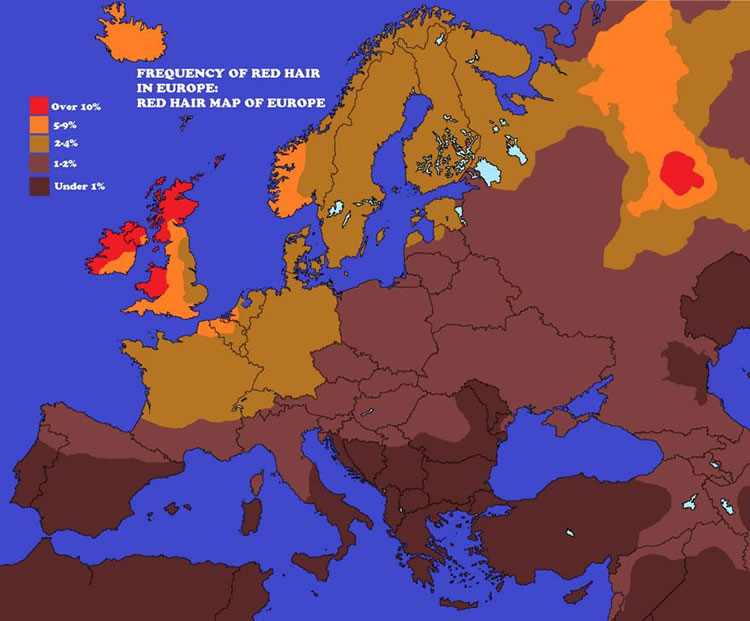
Image credits: imgur.com
Average Breast Sizes By Country
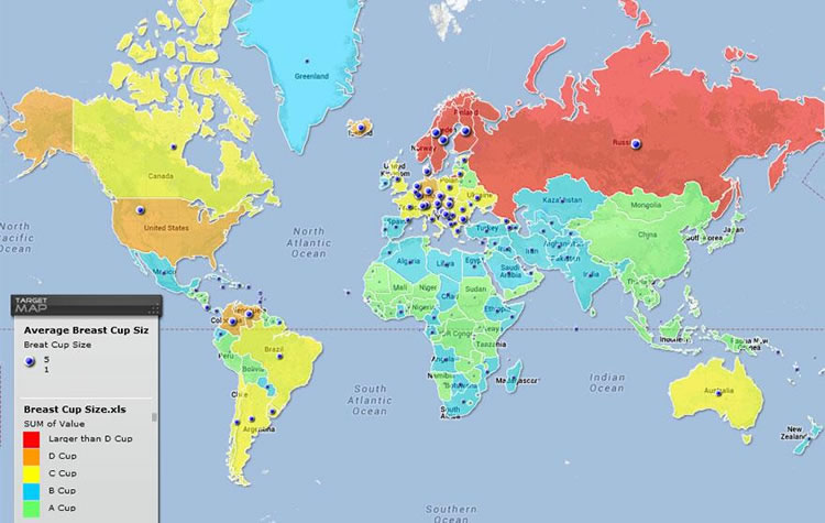
Image credits: targetmap.com
Penis Size Worldwide
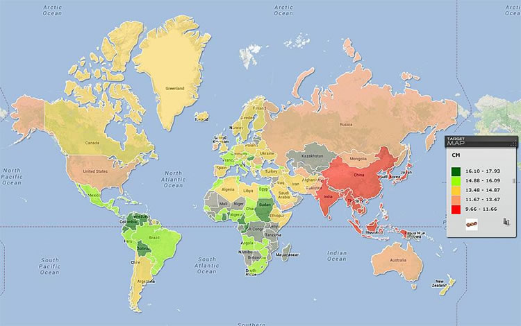
Image credits: targetmap.com
How Many Beers Will Minimum Wage Get You In Europe?

Image credits: imgur.com
More People Live Inside This Circle Than Outside Of It

Image credits: washingtonpost.com
Google Autocomplete Results: Europe
Image credits: Randal Olson
Google Autocomplete Results: USA

Image credits: Randal Olson
Google Autocomplete Results: Asia

Image credits: system637
Countries Ranked By Emotional Tendencies

Image credits: washingtonpost.com
People In The EU, Aged 25-34, Who Still Live With Their Parents

Image credits: imgur.com
Countries Where Homosexuality Is A Crime
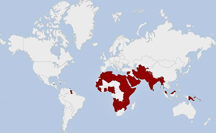
Image credits: businessinsider.com
Best Places To Be Born Map

Image credits: imgur.com
Highest-Paid U.S. Public Employees By State

Image credits: deadspin.com
Educational Backgrounds of World Leaders

Image credits: reddit.com
How The World Would Look If Mapping Conventions Were Flipped Upside-Down
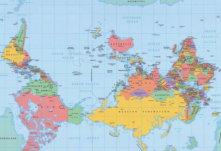
Image credits: unknown
Because orienting north toward the top is a matter of convention rather than correctness, a south-up map is technically just as correct as north-up. Maps with different orientations have appeared in several cultures and time periods. The convention of orienting north to the top (and thus east to the right) was probably established by the astronomer Ptolemy.
Most-Popular Type Of Alcoholic Beverage
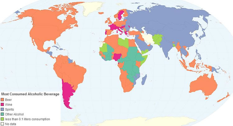
Image credits: chartsbin.com
The World According to Americans


Image credits: alphadesigner.com
Every Country England Has Ever Invaded (all but 22 countries in the world)

Image credits: telegraph.co.uk
Greatest And Lowest Racial Tolerance By Country

Image credits: washingtonpost.com
Cigarettes Smoked Per Person
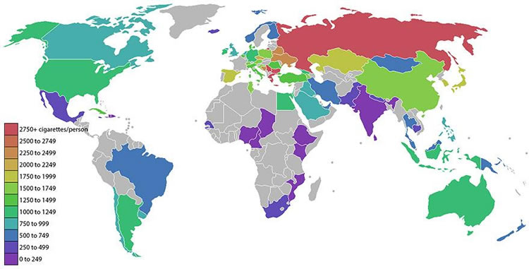
Image credits: washingtonpost.com
Monarchies in the World

Image credits: washingtonpost.com
Global Distribution Of Atheists
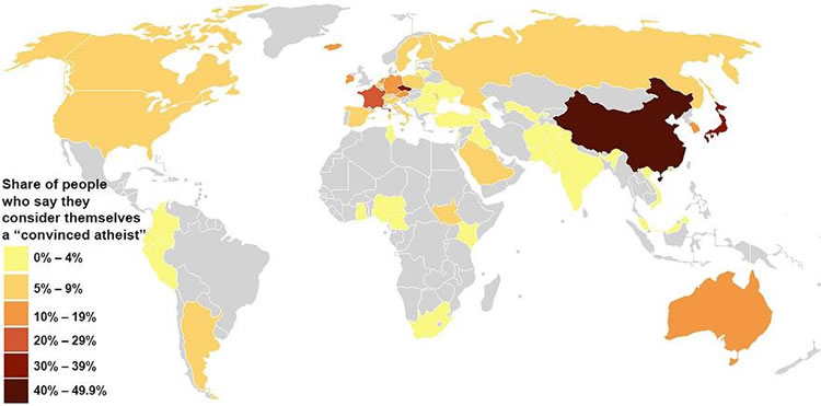
Image credits: washingtonpost.com
Where People Feel The Most And Least Loved
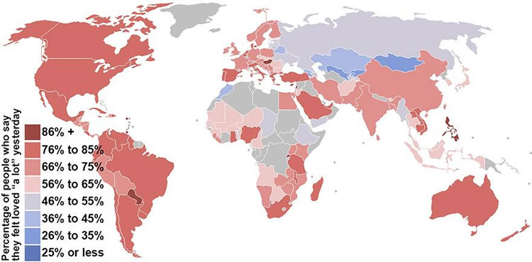
Image credits: washingtonpost.com
Europe vs USA: Sunshine Duration In Hours Per Year

Image credits: imgur.com
Lactose Intolerance

Image credits: eupedia.com
The Most Popular Countries In The World To Visit
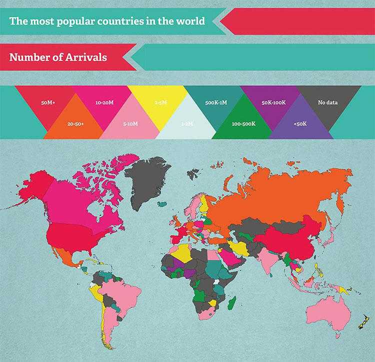
Image credits: movehub.com
The Most-Listened-To Artist In Every U.S. State

Image credits: businessinsider.com
The Most Famous Brand From Each State In The U.S.
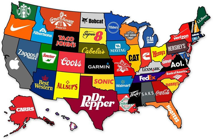
Image credits: mapsontheweb.tumblr.com